Airbnb Analysis, Visualization and Prediction
May 2021
2908 Words, 17 Minutes
Break down of this notebook
- Importing Libraries
- Loading the dataset
- Data Preprocessing
- Filling in missing values .
- Cleaning individual columns.
- Data Visualization: Using plots to find relations between the features.
- Get Correlation between different variables
- Plot all Neighbourhood Group
- Plot Neighbourhood
- Plot bRoom Type
- One hot encoding
- We can’t preprocess the dataframe which has categorical data, so let’s get some dummies instead of them
- Standardizing the dataset
- Splitting the dataset into train and test
- Applying the model
Lets import the necessary libraries
import numpy as np
import pandas as pd
import scipy
from sklearn.preprocessing import MinMaxScaler
import matplotlib.pyplot as plt
import seaborn as sns
#Common Model Algorithms
from sklearn import svm, tree, linear_model, neighbors, naive_bayes, ensemble, discriminant_analysis, gaussian_process

#Common Model Helpers
from sklearn.preprocessing import OneHotEncoder, LabelEncoder
from sklearn import feature_selection
from sklearn import model_selection
from sklearn import metrics

#Visualization
import matplotlib as mpl
import matplotlib.pylab as pylab
import seaborn as sns
from pandas.plotting import autocorrelation_plot

#Configure Visualization Defaults
#%matplotlib inline = show plots in Jupyter Notebook browser
%matplotlib inline
mpl.style.use('ggplot')
sns.set_style('white')
pylab.rcParams['figure.figsize'] = 12,8
Reading the csv file
df=pd.read_csv('data1/AB_NYC_2019.csv')
df.head(5)
Its output
	id	name	host_id	host_name	neighbourhood_group	neighbourhood	latitude	longitude	room_type	price	minimum_nights	number_of_reviews	last_review	reviews_per_month	calculated_host_listings_count	availability_365
0	2539	Clean & quiet apt home by the park	2787	John	Brooklyn	Kensington	40.64749	-73.97237	Private room	149	1	9	2018-10-19	0.21	6	365
1	2595	Skylit Midtown Castle	2845	Jennifer	Manhattan	Midtown	40.75362	-73.98377	Entire home/apt	225	1	45	2019-05-21	0.38	2	355
2	3647	THE VILLAGE OF HARLEM....NEW YORK !	4632	Elisabeth	Manhattan	Harlem	40.80902	-73.94190	Private room	150	3	0	NaN	NaN	1	365
3	3831	Cozy Entire Floor of Brownstone	4869	LisaRoxanne	Brooklyn	Clinton Hill	40.68514	-73.95976	Entire home/apt	89	1	270	2019-07-05	4.64	1	194
4	5022	Entire Apt: Spacious Studio/Loft by central park	7192	Laura	Manhattan	East Harlem	40.79851	-73.94399	Entire home/apt	80	10	9	2018-11-19	0.10	1	0
Data Preprocessing
- Initially we will check for the null values
df.isnull().sum()
Output
id                                    0
name                                 16
host_id                               0
host_name                            21
neighbourhood_group                   0
neighbourhood                         0
latitude                              0
longitude                             0
room_type                             0
price                                 0
minimum_nights                        0
number_of_reviews                     0
last_review                       10052
reviews_per_month                 10052
calculated_host_listings_count        0
availability_365                      0
dtype: int64
- Now, we will fill in for the missing values.
#Filling in the missing values
df.fillna({'reviews_per_month':0},inplace=True)
df.fillna({'name':"NoName"}, inplace=True)
df.fillna({'host_name':"NoName"}, inplace=True)
df.fillna({'last_review':"NotReviewed"}, inplace=True)
- Lets check, did the missing values reduce ?
df.isnull().sum()
Output
id                                0
name                              0
host_id                           0
host_name                         0
neighbourhood_group               0
neighbourhood                     0
latitude                          0
longitude                         0
room_type                         0
price                             0
minimum_nights                    0
number_of_reviews                 0
last_review                       0
reviews_per_month                 0
calculated_host_listings_count    0
availability_365                  0
dtype: int64
- Great, seems like we have no missing values
Data Visualization
-
Let us put our visual senses into play, and visualize the features in the dataset.
-
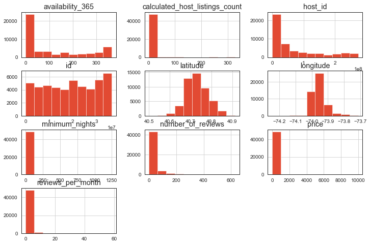
Histogram of our data
df.hist()
plt.show()
Output
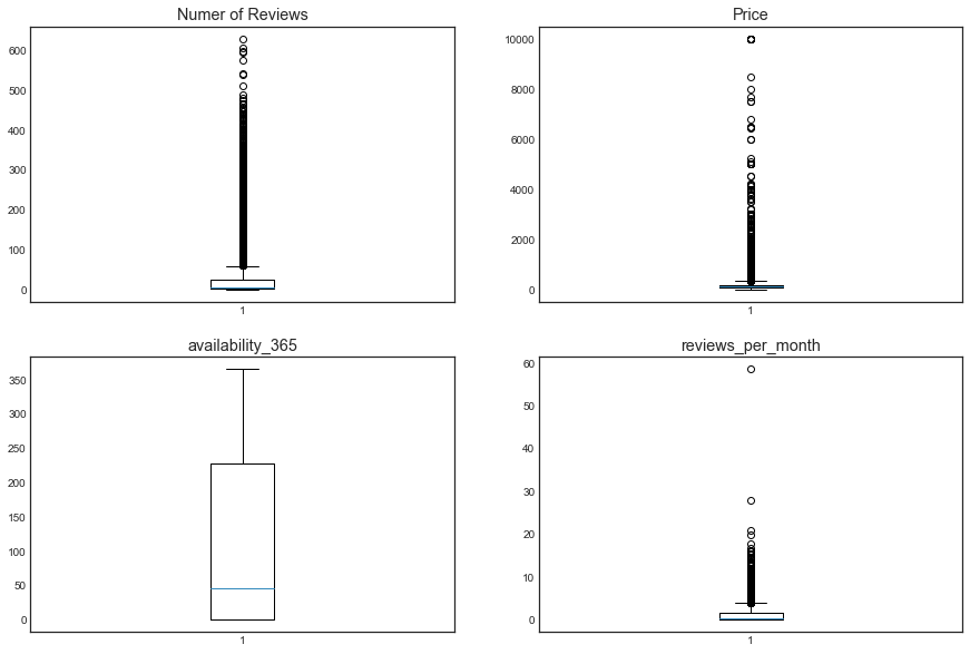
- Box plot of the columns of the dataset
plt.figure(figsize = (15, 10))
plt.style.use('seaborn-white')
ax=plt.subplot(221)
plt.boxplot(df['number_of_reviews'])
ax.set_title('Numer of Reviews')
ax=plt.subplot(222)
plt.boxplot(df['price'])
ax.set_title('Price')
ax=plt.subplot(223)
plt.boxplot(df['availability_365'])
ax.set_title('availability_365')
ax=plt.subplot(224)
plt.boxplot(df['reviews_per_month'])
ax.set_title('reviews_per_month')
Output
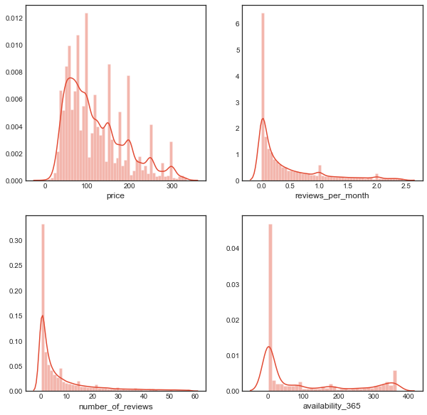
- Calculating the interquartile ranges of price, number_of_reviews , and reviews_per_month
Q1 = df['price'].quantile(0.25)
Q3 = df['price'].quantile(0.75)
IQR = Q3 - Q1    #IQR is interquartile range.

filter = (df['price'] >= Q1 - 1.5 * IQR) & (df['price'] <= Q3 + 1.5 *IQR)
airbnb1=df.loc[filter]

Q1 = df['number_of_reviews'].quantile(0.25)
Q3 = df['number_of_reviews'].quantile(0.75)
IQR = Q3 - Q1    #IQR is interquartile range.

filter = (airbnb1['number_of_reviews'] >= Q1 - 1.5 * IQR) & (airbnb1['number_of_reviews'] <= Q3 + 1.5 *IQR)
airbnb2=airbnb1.loc[filter]


Q1 = airbnb2['reviews_per_month'].quantile(0.25)
Q3 = airbnb2['reviews_per_month'].quantile(0.75)
IQR = Q3 - Q1    #IQR is interquartile range.

filter = (airbnb2['reviews_per_month'] >= Q1 - 1.5 * IQR) & (airbnb2['reviews_per_month'] <= Q3 + 1.5 *IQR)
airbnb_new=airbnb2.loc[filter]

plt.figure(figsize = (15, 7))
plt.style.use('seaborn-white')
plt.subplot(221)
sns.distplot(airbnb_new['price'])
fig = plt.gcf()
fig.set_size_inches(10,10)
plt.subplot(222)
sns.distplot(airbnb_new['reviews_per_month'])
fig = plt.gcf()
fig.set_size_inches(10,10)
plt.subplot(223)
sns.distplot(airbnb_new['number_of_reviews'])
fig = plt.gcf()
fig.set_size_inches(10,10)
plt.subplot(224)
sns.distplot(airbnb_new['availability_365'])
fig = plt.gcf()
fig.set_size_inches(10,10)
Output
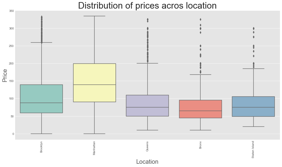
- Boxplot of distribution of prices across the location
plt.style.use('ggplot')
plt.rcParams['figure.figsize'] = (16, 8)
ax = sns.boxplot(x = airbnb_new['neighbourhood_group'], y =airbnb_new['price'], data = airbnb_new, palette = 'Set3')
ax.set_xlabel(xlabel = 'Location', fontsize = 20)
ax.set_ylabel(ylabel = 'Price', fontsize = 20)
ax.set_title(label = 'Distribution of prices acros location', fontsize = 30)
plt.xticks(rotation = 90)
plt.show()
Output
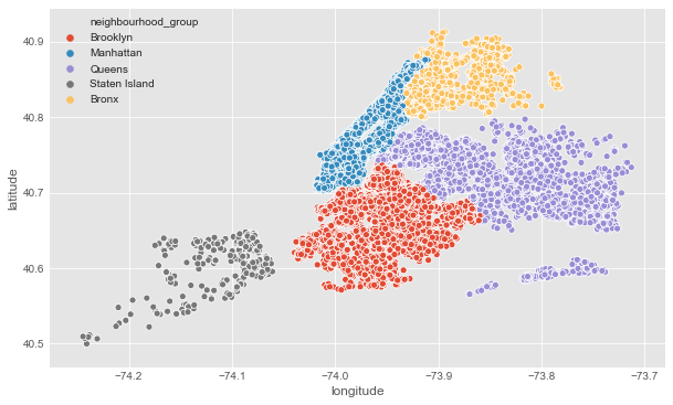
- Scatter Plot of neighbourhood group
# Neighbourhood
plt.figure(figsize=(10,6))
sns.scatterplot(df.longitude,df.latitude,hue=df.neighbourhood_group)
plt.ioff()
Output
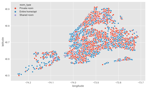
- Scatter plot of room types
#Room types
plt.figure(figsize=(10,6))
sns.scatterplot(df.longitude,df.latitude,hue=df.room_type)
plt.ioff()
Output
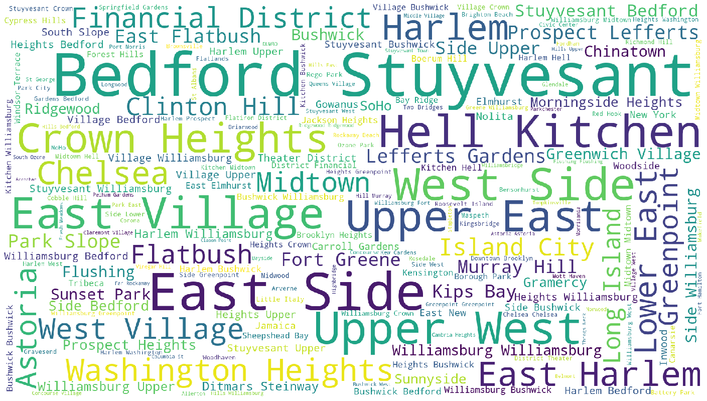
Generating a word cloud
#Generating word cloud
from wordcloud import WordCloud
plt.subplots(figsize=(25,15))
wordcloud = WordCloud(
                          background_color='white',
                          width=1920,
                          height=1080
                         ).generate(" ".join(df.neighbourhood))
plt.imshow(wordcloud)
plt.axis('off')
plt.savefig('neighbourhood.png')
plt.show()
Output
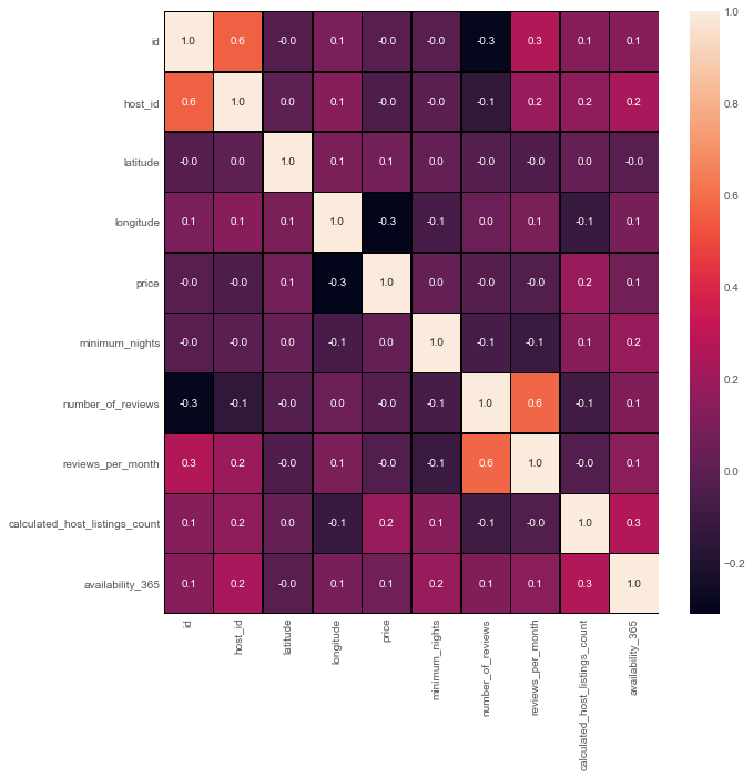
Creating a correlation matrix
- A correlation matrix is simply a table which displays the correlation coefficients for different variables. The matrix depicts the correlation between all the possible pairs of values in a table. It is a powerful tool to summarize a large dataset and to identify and visualize patterns in the given data
f,ax=plt.subplots(figsize=(10,10))
sns.heatmap(airbnb_new.corr(),annot=True,linewidths=0.5,linecolor="black",fmt=".1f",ax=ax)
plt.show()
Output
Preprocessing further
#Preprocessing
airbnb_features=airbnb_new[['neighbourhood_group','room_type','availability_365','minimum_nights','calculated_host_listings_count','reviews_per_month','number_of_reviews']]
airbnb_features.head()
#One hot encoding- Neighbourhood and Room type
#We can't preprocess the dataframe which has categorical data, so let's get some dummies instead of them

dummy_neighbourhood=pd.get_dummies(airbnb_features['neighbourhood_group'], prefix='dummy')
dummy_roomtype=pd.get_dummies(airbnb_features['room_type'], prefix='dummy')
airbnb_features = pd.concat([airbnb_features,dummy_neighbourhood,dummy_roomtype],axis=1)
airbnb_features.drop(['neighbourhood_group','room_type'],axis=1, inplace=True)
airbnb_features
Output
availability_365	minimum_nights	calculated_host_listings_count	reviews_per_month	number_of_reviews	dummy_Bronx	dummy_Brooklyn	dummy_Manhattan	dummy_Queens	dummy_Staten Island	dummy_Entire home/apt	dummy_Private room	dummy_Shared room
0	365	1	6	0.21	9	0	1	0	0	0	0	1	0
1	355	1	2	0.38	45	0	0	1	0	0	1	0	0
2	365	3	1	0.00	0	0	0	1	0	0	0	1	0
4	0	10	1	0.10	9	0	0	1	0	0	1	0	0
6	0	45	1	0.40	49	0	1	0	0	0	0	1	0
...	...	...	...	...	...	...	...	...	...	...	...	...	...
48890	9	2	2	0.00	0	0	1	0	0	0	0	1	0
48891	36	4	2	0.00	0	0	1	0	0	0	0	1	0
48892	27	10	1	0.00	0	0	0	1	0	0	1	0	0
48893	2	1	6	0.00	0	0	0	1	0	0	0	0	1
48894	23	7	1	0.00	0	0	0	1	0	0	0	1	0
36130 rows × 13 columns
Standardizing the values
#Standardizing our dataset + Setting Feature(X) and Target(y)
from sklearn import preprocessing
X=preprocessing.scale(airbnb_features)
y=airbnb_new.price
print(X)
print(y)
X = pd.DataFrame(X)
X=X.rename(index=str, columns={0:'availability_365',1:'minimum_nights',2:'calculated_host_listings_count',3:'reviews_per_month',
                             4:'number_of_reviews',5:'dummy_Bronx',6:'dummy_Brooklyn',7:'dummy_Manhattan',8:'dummy_Queens',9:'dummy_Staten Island',
                             10:'dummy_Entire home/apt',11:'dummy_Private room',12:'dummy_Shared room'})
X.head()
Building the Random Forest Regressor Model
- A random forest is a meta estimator that fits a number of classifying decision trees on various sub-samples of the dataset and uses averaging to improve the predictive accuracy and control over-fitting. The sub-sample size is controlled with the max_samples parameter if bootstrap=True (default), otherwise the whole dataset is used to build each tree.
from sklearn.ensemble import RandomForestRegressor
from sklearn.pipeline import Pipeline

my_pipeline = Pipeline(steps=[('model', RandomForestRegressor(n_estimators=50,random_state=0))])
from sklearn.model_selection import cross_val_score

# Multiply by -1 since sklearn calculates *negative* MAE
scores = -1 * cross_val_score(my_pipeline, X, y,
                              cv=5,
                              scoring='neg_mean_absolute_error')

print("MAE scores:\n", scores)
print("Average MAE score (across experiments):",scores.mean())

from sklearn.pipeline import make_pipeline
from sklearn.ensemble import RandomForestClassifier
from sklearn.model_selection import cross_val_score
from sklearn.model_selection import train_test_split
train_X, val_X, train_y, val_y = train_test_split(X, y, random_state=1)
from sklearn.ensemble import RandomForestRegressor
from sklearn.metrics import mean_absolute_error
model = RandomForestRegressor(n_estimators=100, random_state=0)
model.fit(train_X, train_y)
preds = model.predict(val_X)
print(mean_absolute_error(val_y, preds))
- Difference between actual and predicted values
error_airbnb = pd.DataFrame({
        'Actual Values': np.array(val_y).round(),
        'Predicted Values': preds.round()}).head(20)
error_airbnb.head(5)
Output
	Actual Values	Predicted Values
0	205	134.0
1	40	59.0
2	50	55.0
3	50	50.0
4	175	172.0